Introduction
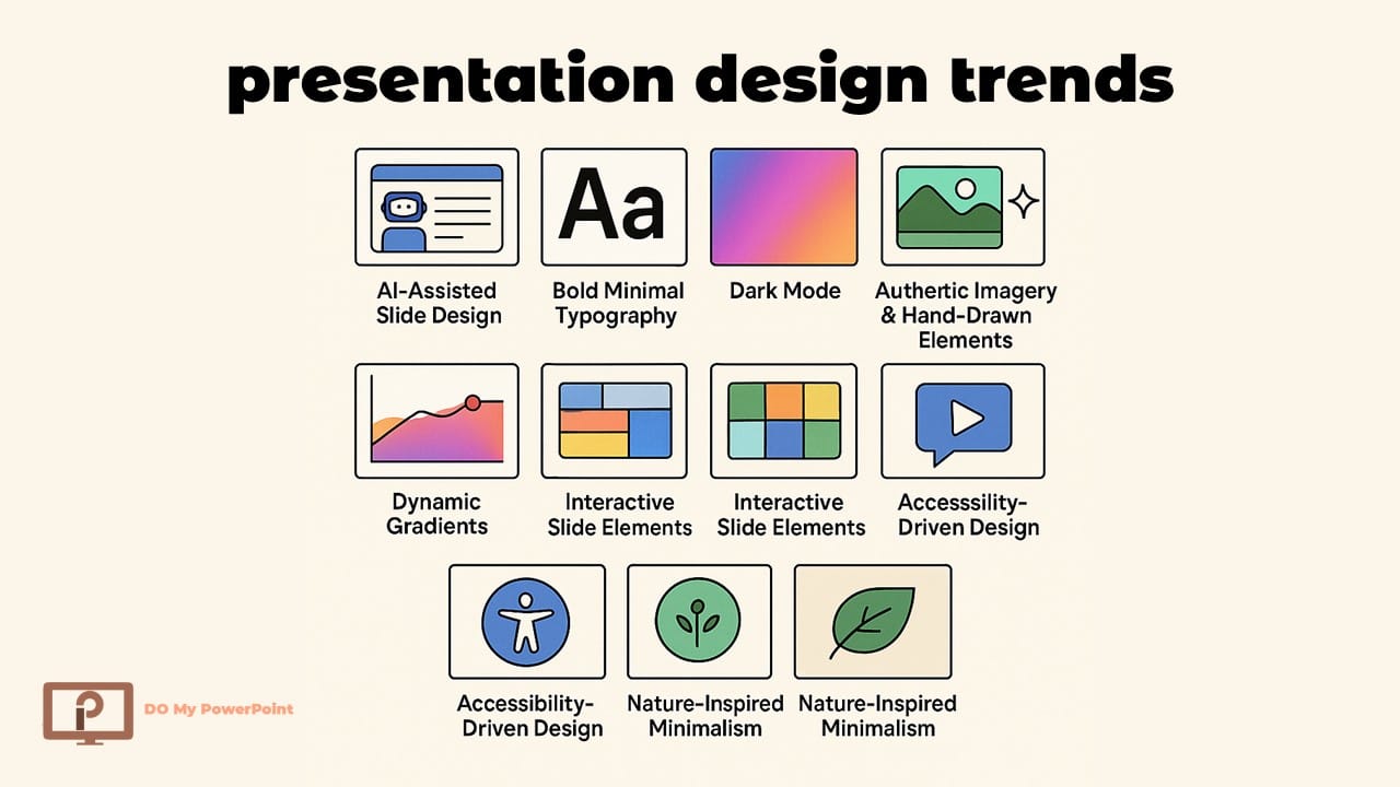
In this guide, we explore the latest presentation design trends 2026 and how they shape modern, professional slide design.
The way presentations are designed is changing quicker than ever. People want clear, visually appealing, and well-told stories in 2025, not presentations full of text that are hard to read.
Slides nowadays need to seem planned, neat, and in line with what you’re saying. Anyone who does corporate presentations, pitch decks, webinars, or instructional content needs to know about the newest presentation design trends 2026.
This post shows you 10 useful slide design trends that you can start applying right away. Each trend is easy to use, looks good, and is in line with what the best presentation designers do today. There are also helpful internal resources within the text that can help you learn more about your site.
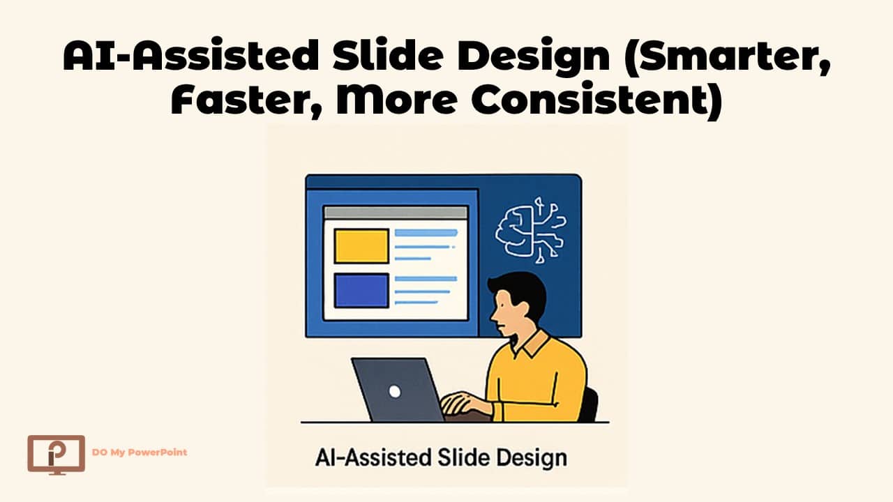
Trend 1: AI-Assisted Slide Design (Smarter, Faster, More Consistent)
AI is changing the way presentations are made. AI-powered tools let you keep high-quality images while speeding up the creative process by making layouts and recommending color palettes.
Why It Matters
- Makes design processes go faster
- Makes layouts that are tidy and fit with the brand
- Makes slides more consistent with each other
How to Use It
- Use AI to make the first slide layouts, then fix them by hand.
- Make icons, charts, and pictures using AI
- Get over creative obstacles with slide recommendations based on prompts
Today, several powerful AI tools help designers create professional slides faster than ever. Popular platforms like Beautiful.ai, Tome AI, Canva Magic Design, PowerPoint Designer / Copilot, Gamma.app and Pitch can generate layouts, suggest color palettes, rewrite content, and accelerate the entire presentation design workflow.
If you want to learn more about what a human designer does in this new AI-powered world, check out this page: What Is a Presentation Designer
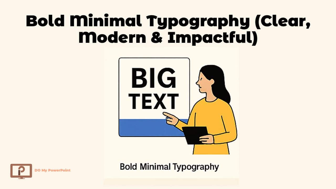
Trend 2: Bold Minimal Typography (Clear, Modern & Impactful)
Minimal typography with big fonts is one of the top presentation design trends 2026. Big, clean headlines help your message shine out without being too much for the reader.
Benefits
- Sends ideas right away
- Improves the order of slides
- Keeps slides up-to-date and tidy
Implementation Tips
- Use strong sans-serif fonts for headings.
- One main point per slide of text
- Put big text together with lots of empty space.
To learn the basics of how to organize a nice slide, go to this page: presentation design PowerPoint
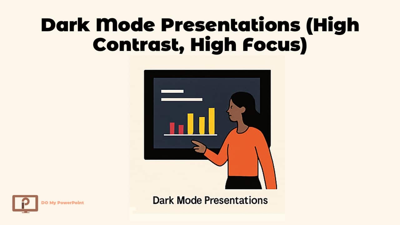
Trend 3: Dark Mode Presentations (High Contrast, High Focus)
Dark mode isn’t simply a trend in user interfaces; it’s also becoming more popular in presentation design. It gives everything a movie-like vibe, helps bright things stand out, and makes your eyes feel better.
How to Use It:
- Use dark colors for the backdrop (charcoal, navy, graphite)
- Use strong accent colors to highlight important elements.
- Make sure the text and backdrop are very different from each other.
- Check how easy it is to read on big displays.
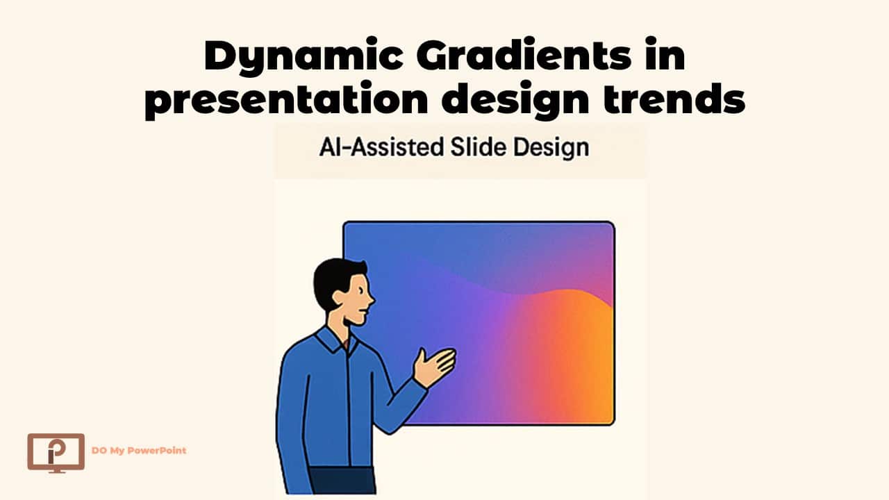
Trend 4: Dynamic Gradients in presentation design trends
Today’s gradients are soft, smooth, and atmospheric. They give your slides a trendy look without using backdrops that are too busy.
Gradients that are popular in 2026:
- From blue →purple
- Green →Aqua
- Pink → Orange
How to Use Them:
- Keep the gradients gentle and not too bright.
- Don’t put mixed gradients after big paragraphs.
- Use bold fonts with gradient backgrounds
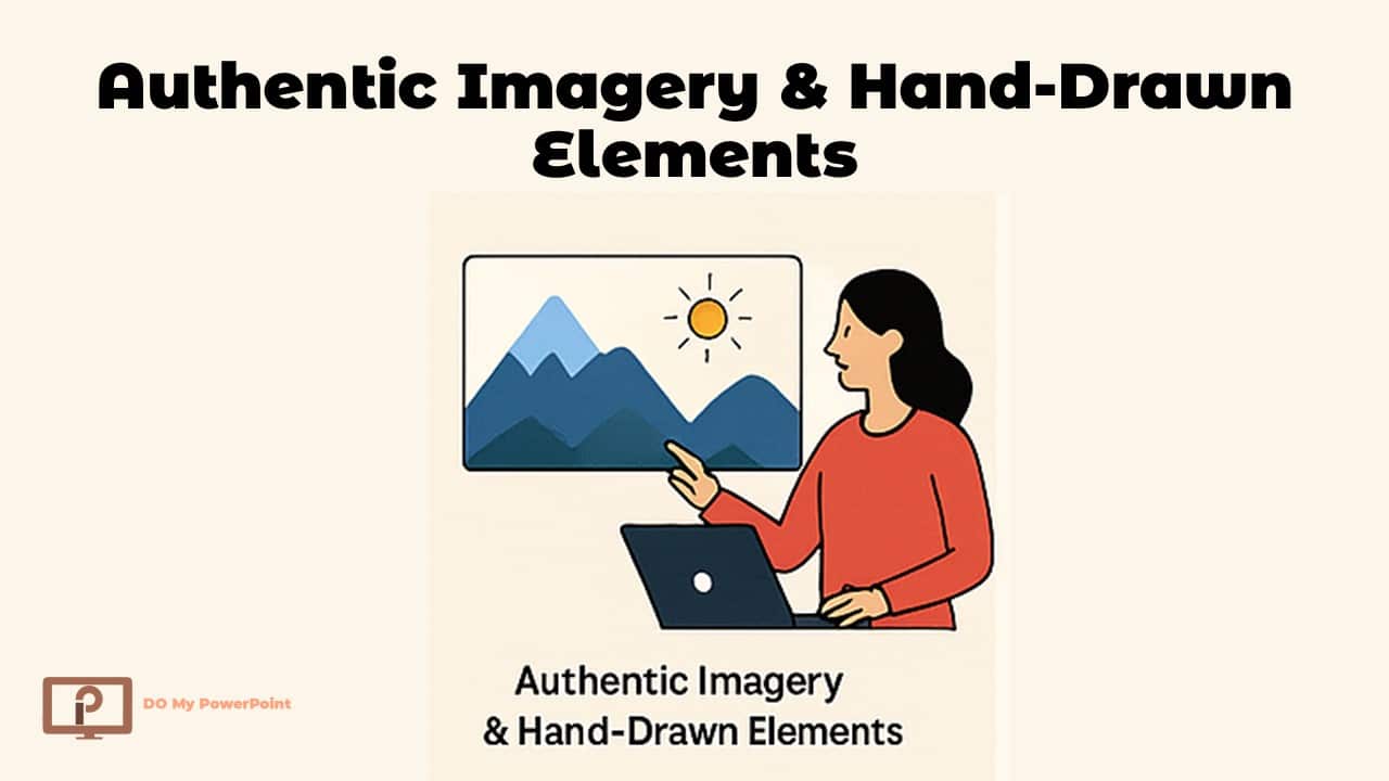
Trend 5: Authentic Imagery & Hand-Drawn Elements
People are sick of using generic stock photographs. Real photographs, hand-drawn forms, scribbled arrows, and bespoke symbols are going to take over in 2026.
How It Works
- More human and relatable
- Gives slides a distinctive appearance
- Helps tell stories
How to Use It
- When you can, use actual pictures instead than stock photos.
- To make a point, draw arrows or circles by hand.
- Use basic hand-drawn icons to make it seem like you.
This comparison is important if you want to know how presentation design is different from regular graphic design: Graphic designer vs. presentation designer
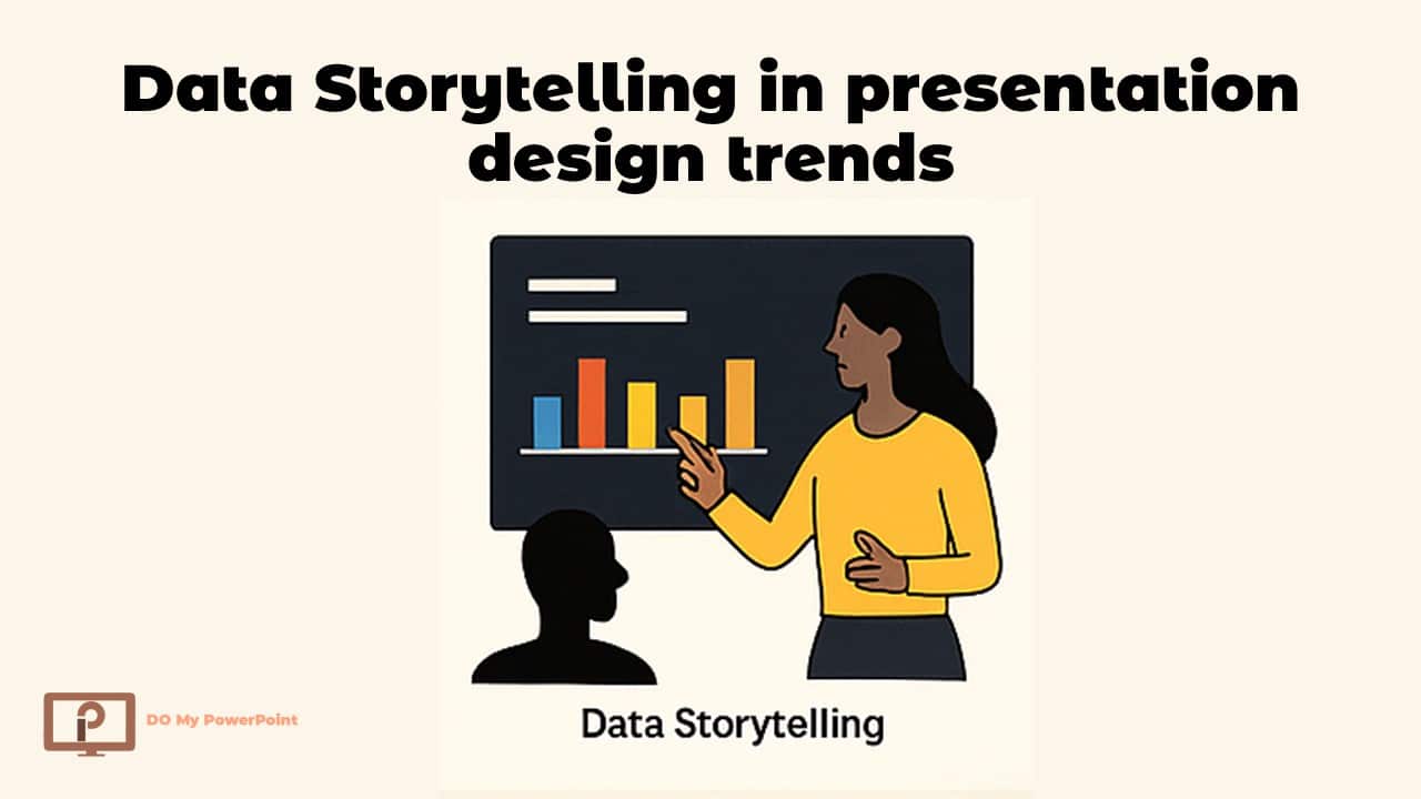
Trend 6: Data Storytelling in presentation design trends
One of the most useful “slide design trends” is turning data into interesting narrative. People don’t want raw figures; they want precise information.
How to Use Data Storytelling
- Don’t start with the chart; start with the message.
- Only highlight the data points that matter.
- Use charts that are tidy and easy to read.
- Step-by-step, make complicated charts move
Things to Stay Away From
- Tables that are too full
- Too many hues
- Charts without any context
One of the main distinctions between amateur and expert presentation designers is how well they convey stories with data.
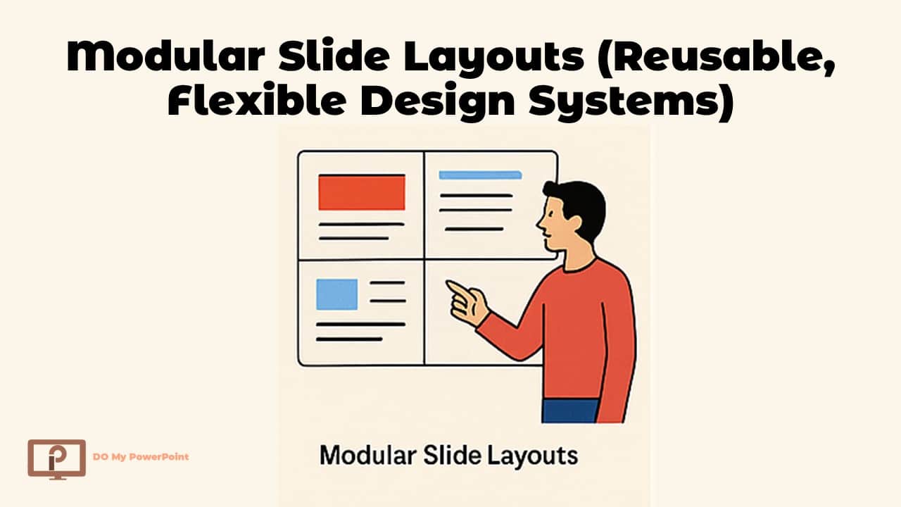
Trend 7: Modular Slide Layouts (Reusable, Flexible Design Systems)
You may effortlessly move around preconfigured content components in modular layouts. This trend works quite well for organizations that often make presentations.
Why modular layouts are good
- Making slides faster
- More consistent
- Perfect for business templates
How to Use Modular Blocks
- Make 5 to 7 master blocks, such as a title, a quote, a list, a picture, or a comparison.
- Keep the same margins and spacing
- Use grid systems to line things up
To learn more about the professional design standards that are often used in corporate presentations, visit: presentation design services
Trend 8: Interactive Slide Elements in presentation design trends
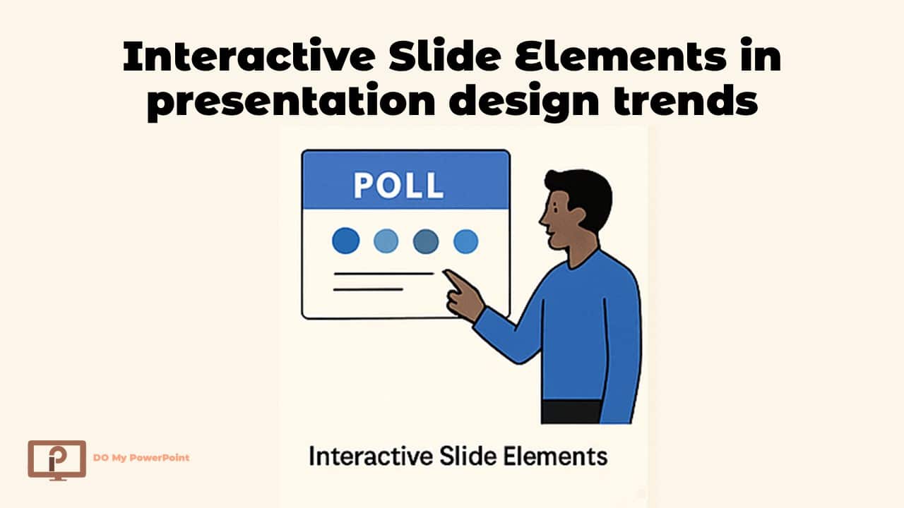
Things to Add That Are Interactive
- Navigation that you may click on
- Polls or quizzes that are built in
- Infographics that move
- Indicators of advancement step by step
Helpful Hint
- Don’t use interactivity too much. Too much involvement might be distracting instead than interesting.
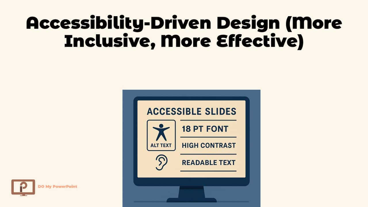
Trend 9: Accessibility-Driven Design (More Inclusive, More Effective)
Accessibility is no longer a choice. Everyone should be able to read the slides, no matter what their ability or device is.
Important Rules for Accessibility
- Font size must be at least 16–18 pt
- There is a lot of contrast between the text and the backdrop.
- Text that goes with pictures
- Language that is easy to read
- Don’t put text on top of pictures
Extra Benefit
- Accessible slides make SEO behavior metrics like dwell time and user pleasure better.
Trend 10: Nature-Inspired Minimalism (Calm, Modern & Professional)
Many businesses are starting to like natural materials, earthy color schemes, and simple layouts. This trend makes your presentations feel more calm and balanced.
Things to Look at in This Trend
- Colors that aren’t too bright (beige, sand, forest green)
- Shapes that are simple and lovely
- Layouts that are clean and have wide margins
This style works especially well for presentations about education, coaching, design, and health.
Conclusion
Presentation design trends are still moving toward clear, story-based, and meaningful images.
Here are some presentation design trends 2026 that can help you make current, interesting, and professional slides for every type of presentation, whether it’s a pitch deck, a corporate presentation, or a training session.
These sites can help you if you want to improve your presentation with expert aid or if you want to know how much design work costs:
Pricing and pricing guides:
With these trends and tools, you have all you need to make presentations that stand out in 2026 and beyond.
