Common Mistakes in PowerPoint Presentations to Avoid
When used correctly, PowerPoint is a really useful tool. But it’s also quite simple to utilize it the incorrect way. It isn’t always because the speaker doesn’t know what they’re talking about that their presentations don’t go well. Sometimes it’s because their slides are too busy, hard to understand, or boring. In this article, we’ll look at the the most common mistakes in PowerPoint presentations, examine bad PowerPoint examples and give you useful advice on what to avoid so that you can provide a clean, professional presentation.
Why Common Mistakes in PowerPoint Presentations Matter?
Your PowerPoint slides are a way to show people what you’re saying, whether you’re proposing an idea, giving a class, or running a business meeting. But what if they make it harder for you to talk to each other?
The audience can lose interest, become confused, or feel overwhelmed if your presentations aren’t adequately designed.
If you make mistakes with the formatting, style, or even the colors of your slides, they might take away from your primary point or make you look unprofessional.
You should pay attention to these PowerPoint mistakes to avoid, otherwise they might ruin your whole presentation.
That’s why it’s crucial to know not just what to put on your slides but also what not to put on them.
Want a mistake-free presentation? Try our professional PowerPoint design services today!
10 Common Mistakes in PowerPoint Presentations
Here are the most common blunders people make when they plan and do their presentations:
1. Too Much Text on a Slide
One of the most common mistakes presenters make while giving presentations is converting slides into papers. Putting a lot of text in a slide makes it hard to read and understand. People can’t listen to you and read a book at the same time.
Fix: Stick to short bullet points or key phrases. Use the 6×6 rule: no more than 6 lines per slide and 6 words per line. Also read the article “How to Print PowerPoint with Notes?” in this regard.
2. Poor Color Contrast
Text might be hard to read if the colors are too close. For instance, yellow lettering on a white backdrop is hard to see. Not only is bad contrast unprofessional, but it also makes it hard for persons with visual problems to see.
Fix: Use high contrast between background and text (e.g., black on white or white on dark blue). Always test your slides on a projector if possible.
3. Low-Quality Images
Images that are grainy, pixelated, or have watermarks on them scream “unprepared.” Graphics that aren’t high enough quality hurt your reputation and take away from your message.
Fix: Use high-resolution images from reliable, copyright-free sources. Avoid stretching or distorting them to fit.
4. Overuse of Animations and Transitions
One of the most unpleasant PowerPoint mistakes to avoid is using too many flashy animations. Transitions may make your slides appear nice, but too many of them might make them look like a party presentation for kids.
Fix: Use simple transitions like “fade” or “wipe” sparingly. Avoid flying text, spinning images, or sound effects unless truly relevant. Also read the article “How to Remove Animations from PowerPoint?“ in this regard.
5. Inconsistent Slide Design
Changing the colors, fonts, or layout styles of presentations makes them look messy. Your design decisions shouldn’t get in the way of your messaging.
Fix: Use a single theme or template throughout the presentation. Stick to a font pair and brand color palette.
Curious about the cost? Check out our PowerPoint design pricing and choose your ideal plan.
6. Unreadable Fonts or Font Sizes
Text that is too small or ornamental might be hard to see, especially in big spaces or on projectors.
Fix: Use simple, sans-serif fonts (like Arial or Calibri). Keep font sizes at least 24pt for body text and larger for headings. Also read the article “Best Fonts for PowerPoint Presentation” in this regard.
7. Cluttered Layout
Putting everything in one slide makes it too much. Slides should not be the whole speech script; they should only emphasize the main points.
Fix: Break complex content into multiple slides. Add spacing, use icons, or group related content.
8. Lack of Visual Hierarchy
Nothing sticks out if everything on the slide looks the same. People in the audience don’t know where to look first.
Fix: Use headings, bold text, and sizing to guide the viewer’s eyes. Highlight important terms or numbers.
9. Overloading with Data
Graphs with ten variables or thick Excel tables are a sure way to confuse your readers.
Fix: Simplify your visuals. Focus on the key data point and offer details verbally or in a handout.
10. Ignoring the Audience’s Needs
Your slides may make sense to you, but do they make sense to your audience? One of the most common mistakes presenters make is not thinking about their audience.
Fix: Know your audience. Tailor the complexity, tone, and visuals to their level of understanding.
Already have a presentation but need a visual upgrade? Use our PowerPoint redesign services to make it shine!
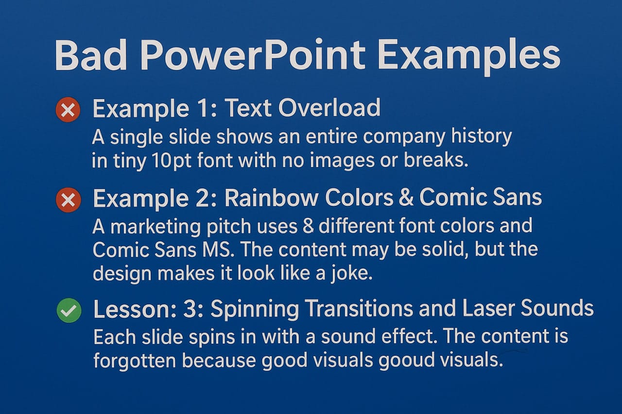
Bad PowerPoint Examples You Shouldn’t Repeat
Let’s look at some made-up yet actual bad PowerPoint slides examples that show how horrible design decisions may be:
Example 1: Text Overload
A single presentation presents the whole history of a corporation in small 10pt type with no pictures or breaks. The audience reads as the speaker talks, and no one recalls anything.
Example 2: Rainbow Colors & Comic Sans
Comic Sans MS and eight other font colors are used in a marketing presentation. The design makes it appear like a joke, even when the substance is good.
Example 3: Spinning Transitions and Laser Sounds
Every slide comes in with a sound effect. People are laughing, so they forget what the subject is about.
Lesson: These are perfect instances of PowerPoint mistakes to avoid. Good images go with good substance.
Got a big pitch coming up? Let us help you with a stunning pitch deck design.
The Worst PowerPoint Presentations in real life
Things can go wrong even with important presentations:
NASA’s Challenger Report: A presentation obscured key facts in layers of language, which caused to misconceptions that had devastating implications.
Presentations for Startups That Don’t Work: A lot of tech presentations use slides full of jargon that investors don’t understand and don’t explain the problem or the solution.
These worst PowerPoint presentations teach us that design is more than just a nice thing to have; it’s necessary for communication.
PowerPoint Mistakes to Avoid – A Quick Checklist
Before your next lecture, here’s a useful list of PowerPoint mistakes to avoid:
- Too much text
- Cluttered visuals
- Low contrast colors
- Mixed fonts or inconsistent styles
- Poor-quality images
- Overuse of animation
- Illegible fonts or small sizes
- Complex or dense data
- No clear message hierarchy
- Slides not aligned with audience needs
Print it, pin it, and check it before every presentation!
Common Mistakes Presenters Make Beyond the Slides
Remember, it’s not just about slides—it’s about you.
Some presenters:
- Read directly from the screen
- Speak in monotone
- Forget to engage with the audience
- Ignore time constraints
- Avoid eye contact
Even the best-designed slide presentation can be ruined by these common mistakes presenters make.
Tip: Practice your delivery, timing your speech, and talk to the people in the room.
PowerPoint Mistakes to Avoid – Summary Table
|
❌ Common Mistake |
🔧 Fix or Recommendation |
|
«Too much text» |
Keep it brief—use bullet points or keywords, not full paragraphs. |
|
«Cluttered visuals» |
Use white space and clean layout; avoid packing too much on one slide. |
|
«Low contrast colors» |
Ensure high contrast between text and background for readability. |
|
«Inconsistent slide styles» |
Use a single theme, consistent fonts, and colors across all slides. |
|
«Poor-quality images» |
Avoid pixelated or watermarked images; use high-resolution visuals. |
|
«Overused animations» |
Use simple transitions sparingly; avoid distracting effects. |
|
«Unreadable fonts or font sizes» |
Choose clear, sans-serif fonts (e.g., Arial) with font size ≥ 24pt. |
|
«Overloaded data on slides» |
Simplify complex charts or tables; highlight only key data points. |
|
«Lack of visual hierarchy» |
Guide attention using headings, bold text, and varied font sizes. |
|
«Slides not tailored to audience» |
Know your audience; adjust tone, visuals, and content complexity accordingly. |
Visit our YouTube channel to see more PowerPoint tutorials.
Conclusion: Design with Purpose, Present with Confidence
In conclusion, design with a goal in mind and present with confidence.
Thoughtful planning and purposeful delivery are the keys to avoiding the most common mistakes in PowerPoint presentations.
Your slides should help get your point across, not take the place of it. Don’t make things too busy, keep things the same, and always put your audience first.
Use our criteria, look at bad PowerPoint examples, and take your time to make a visual tale that is just as effective as what you say.
No time to build your presentation? Leave it to us and get a ready-to-go deck stress-free! (Contact Us)
FAQ about Mistakes in PowerPoint Presentations
What are the most common mistakes in PowerPoint presentations?
Too much text, poor contrast, inconsistent designs, overuse of animation, and unreadable fonts are some of the top offenders.
What should I avoid in a PowerPoint presentation?
Avoid data overload, unprofessional fonts, low-quality images, and neglecting your audience’s expectations.
How do I fix bad PowerPoint slides examples?
Simplify, stick to one theme, use readable fonts, and cut out any fluff that doesn’t serve your core message.


